When it comes to decorating and designing for babies, color can have a profound effect. It’s a common misconception that babies need bold, highly contrasting colors to recognize shapes and be mentally stimulated, such as black-and-white or primary colors. However, the psychology of color shows that certain hues can affect our moods and even our behavior. For example, advertisers know that red stimulates the appetite, so you’ll often see logos and advertisements for food brands rich in this color. Red is an energizing color so needless to say it’s not a good overall choice for a nursery or toddler’s room! What babies and young children need is a soothing sense of security and calming atmosphere in which to grow and learn.
Miniware’s Swedish lead designer Adam Bonnier follows Scandinavian design theory which integrates children’s spaces and playthings into main living areas and creates harmonious spaces through modern design and the use of soft and light colors.
Beautiful Backdrops
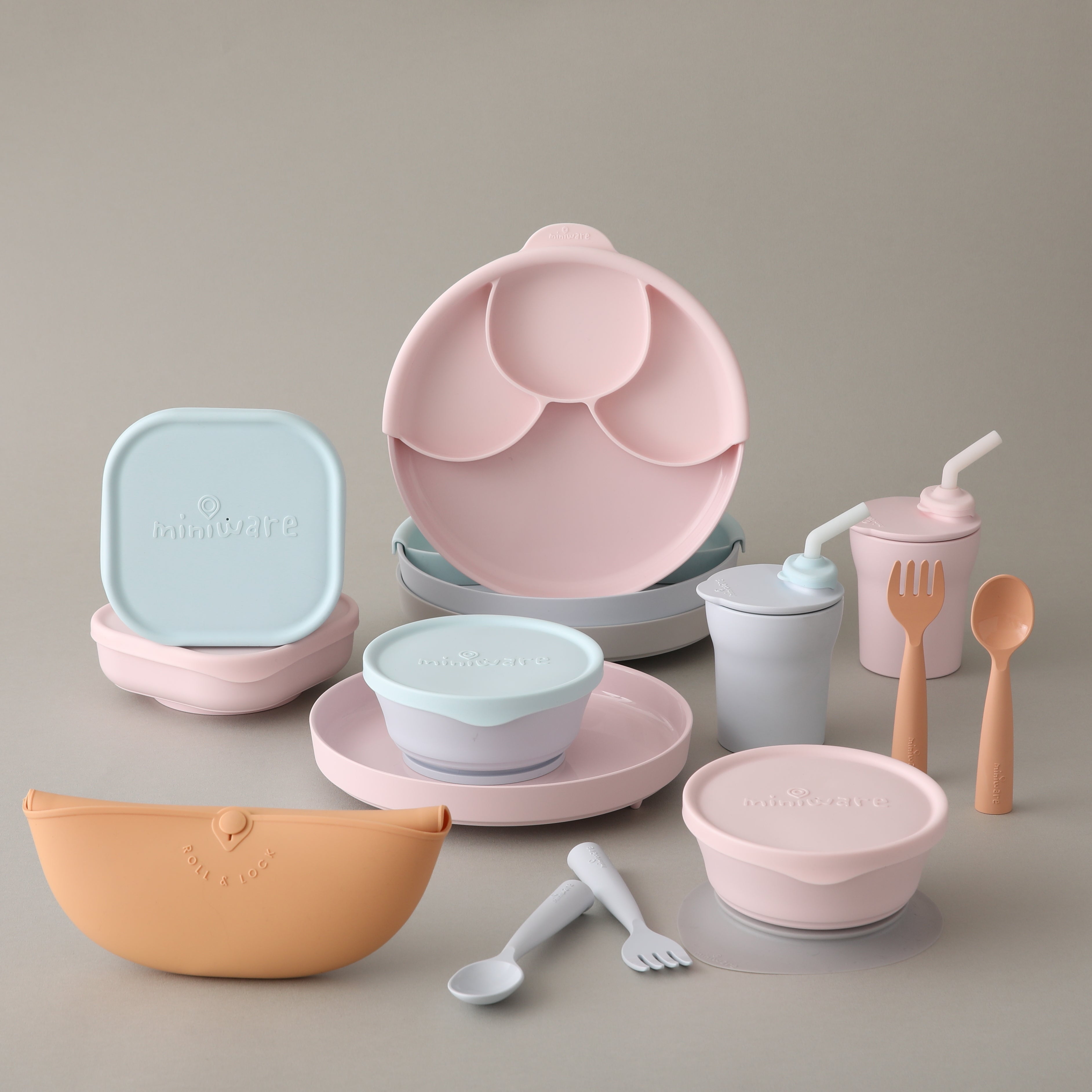
Dishware is more than just a surface upon which to eat food. Its secondary function, a very important one, is to attractively frame and enhance the beauty of our meals. Our collection of Miniware celebrates the clean, modern style of Swedish design and its muted color palette. We selected colors that would be pleasing for baby and non-distracting, so they can focus on food at mealtime, not tableware. Bright colors are over-stimulating and eating should be done in a calm environment. Since color affects your baby’s mood, we chose kid-friendly hues created from all-natural pigments to keep them happy, calm, and healthy. We selected natural and serene support colors as the basis of our tableware. Each color provides a lovely background for food, increasing plate-appeal without over-stimulating babies and young children.
White is a popular dishware color because it provides a perfect backdrop for beautiful food platings. Our Vanilla color is a softer, more calming version of this classic dish color. Our colored PLA is designed with diversified hues to adapt to the baby’s moods and behavior. Go to our shop to discover our colored collections.
Warm Colors
Warm colors tend to reflect comfort, happiness, enthusiasm, and energy.

Often associated with femininity, Pink color elicits also tenderness, softness, innocence, and empathy and creates a calmer and more sensitive feeling. Miniware’s Cotton Candy tableware reminds of the love and warmth of the mother and will help foster positive and supportive learning in a calming atmosphere. Cotton candy plates and bowls are both pleasing to the eye and mood. Many people find pastel pink soothing as well as joyous.

Based on earthy colors, and halfway between the brown color and a darker orange, the Toffee color promotes a welcoming and friendly feeling which increases the desire to interact with the environment. It creates a super-cozy atmosphere that puts reservations at ease encouraging your child to feel safe to explore and learn.
Cool Colors
Cool colors tend to be calming, relaxing. They are the colors of water, of nature, and promotes usually a serene and calming environment.
Blue colors evokes the vastness of the sea and the sky and stimulate a cool and relaxing environment by calming the mind and lowering blood pressure and respiration which decrease the feelings of anxiety and restlessness.

Miniware’s lighter light blue series, with the original aqua silicone parts, like the gradient of nature, make people feel tranquil and peaceful, and help stabilize the baby’s personality. The healing power of the blue will let your child learn to eat independently while making food look delicious.

Gray and green colors are both down-to-earth tone. Gray inspires wisdom. Green represents freshness and nature and thus promotes a serene and calming environment. It is associated with stability and trust. Their combination is soothing, yet alert and wakeful.
The mix and match between grey, blue and green helps your baby to reducing anxiety and promoting concentration to develop the fine-motor skills and move towards the next development milestone.
Fun Colors That Soothe
While our Miniware basics adhere to the guidelines above, our accessories come in an array of playful pastel colors that bring a joyful feeling to the table. Delightfully happy colors that kids love like peach, lavender, pink, and aqua make both design and baby’s food pop. Everything works together for a lovely, peaceful, and harmonious table setting.
When it comes to sleeping and eating, a calm, peaceful environment is best. By selecting soothing colors, you can help foster certain moods in your kids. Bright, energetic colors are best for the playroom while muted pastel colors encourage a low-key, harmonious experience. Of course, color preferences don’t apply to everyone. By taking a moment to observe how different colors affect your baby, you can better use color theory to set the desired mood in all of the baby’s spaces.
Want another peek into beautiful and stylish Swedish homes? Check out this amazing online gallery from the Swedish Design Museum and see modern design and color theory at work!
What colors do your kids love? Have you noticed how color affects your baby?

